

The idea was to represent the virtual credit card in a form that was familiar, rather than reinvent the metaphor.
Early widget design
In Mid 2001, a company named Orbiscom began working with Citi to develop an "online virtual credit card." The idea was to present a credit card sized window on a computer screen, that would generate a one-time 16 digit credit card number to help people feel more comfortable with online purchasing. E-commerce was in it's infancy and many consumers were still nervous about online shopping.
This was about five years before on-screen "widgets." There was eventually two sets of designs. One as a Thick client, which was downloaded and worked as an application, and an online Thin client, which populated in an HTML window (which was not very elegant). The following designs represent the Thick client, for which there was not any border around the client. These were actually early Flash interfaces when it was still a Macromedia product.
Orbiscom was eventually acquired by MasterCard International.
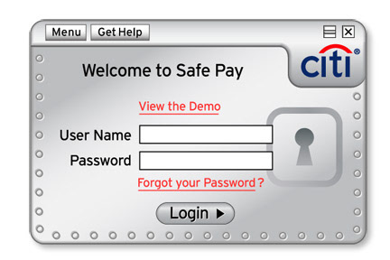
The first concept design shown above, created a strong form factor bar along the top edge. The card portion would collapse and expand like a window shade. The Citi logo was in the same position as the regular plastic card product to draw a correlation. However, the powers at the top were concerned that somehow the virtual card should not resemble the actual card product.
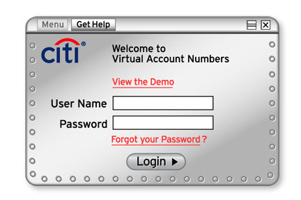
Also the notion of naming the widget something like Safe Pay, was too difficult in the time frame we were working with. So a simple, descriptive name was adopted (Virtual Account Numbers), even if it wasn't particularly concise for Marketing purposes.
Also the notion of naming the widget something like Safe Pay, was too difficult in the time frame we were working with. So a simple, descriptive name was adopted (Virtual Account Numbers), even if it wasn't particularly concise for Marketing purposes.
The strategy for the design was to emulate a card shape and to have all needed user interface functions happen within the form factor. Where the card form factor could not contain all the information such as help, a small window slid out to the right.
The opening screen shown above was simplified and a strong metallic looking approach became an over-the-top reinforcement of security, which strategically made sense at the time.
The opening screen shown above was simplified and a strong metallic looking approach became an over-the-top reinforcement of security, which strategically made sense at the time.

One prevailing challenge was that the design had to be in vector graphics. Bitmapped graphics did not work as well with the underlying Flash technology, so all blends and gradients had to be created with Illustrator rather than Photoshop. I must give full credit to Larry O'Brien (who was our senior Macintosh engineer and expert in Illustrator), for translating the complex blends that made up the form factor design I had designed in Photoshop.

Detail from the corner of the widget, reveals how the vector graphic of hard line, visually combine to create the illusion of a soft blend.


These two screens illustrate the slide-out window for Help. We had to effectively point to the areas in question and explain various functions.


The interface presented the similar challenges as Kiosk touch screens, in that screen sequence becomes the dominant flow. We wanted the user to have the easiest and quickest path possible in a secured environment.
There were options of course for expanded functionality, and each option represented several more screens. In all, there may have been some 40 different screens.
One of the most challenging things about this type of design is version control. As each subsequent revision was determined, it had to be carefully managed and fit into the next iteration. It became a challenge for the content writer (Julie Diano) as well, because all parts of the flow had to make sense as instruction text.
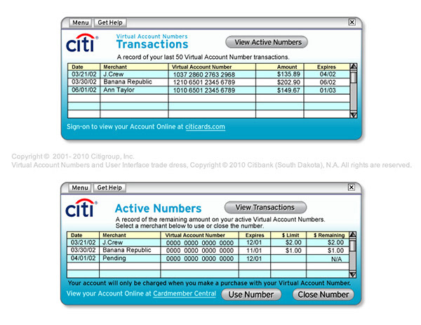
The widget in it's total expanded form factor, was able to display transaction history and current Virtual Numbers in the member account. These are just concept screens with dummy text.