Photography by: The late great Garry McElwee,
Jacksonville, FL 1994
Color retouching: The late great Paul Figura
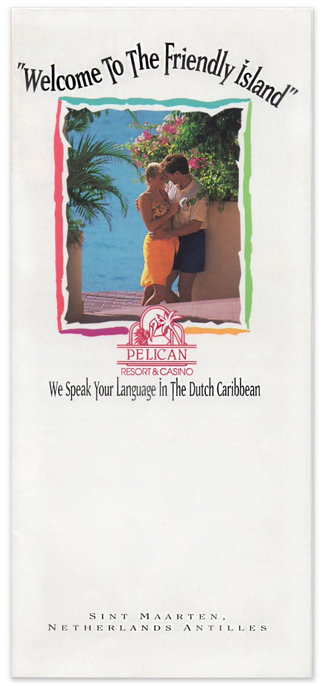
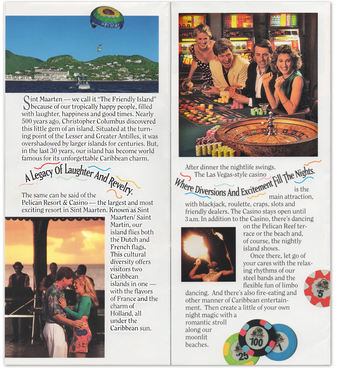
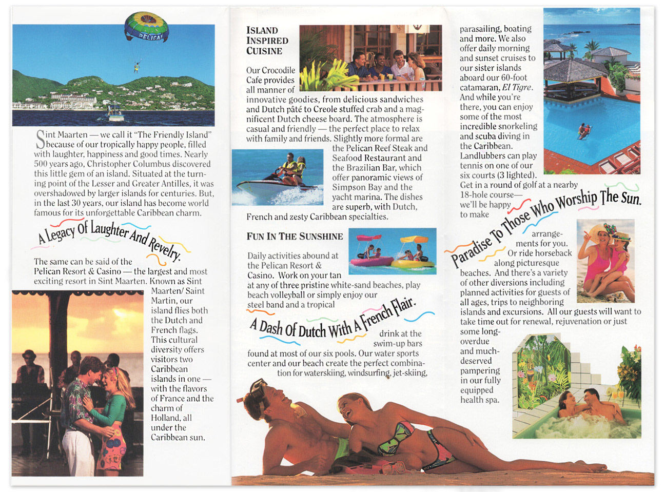
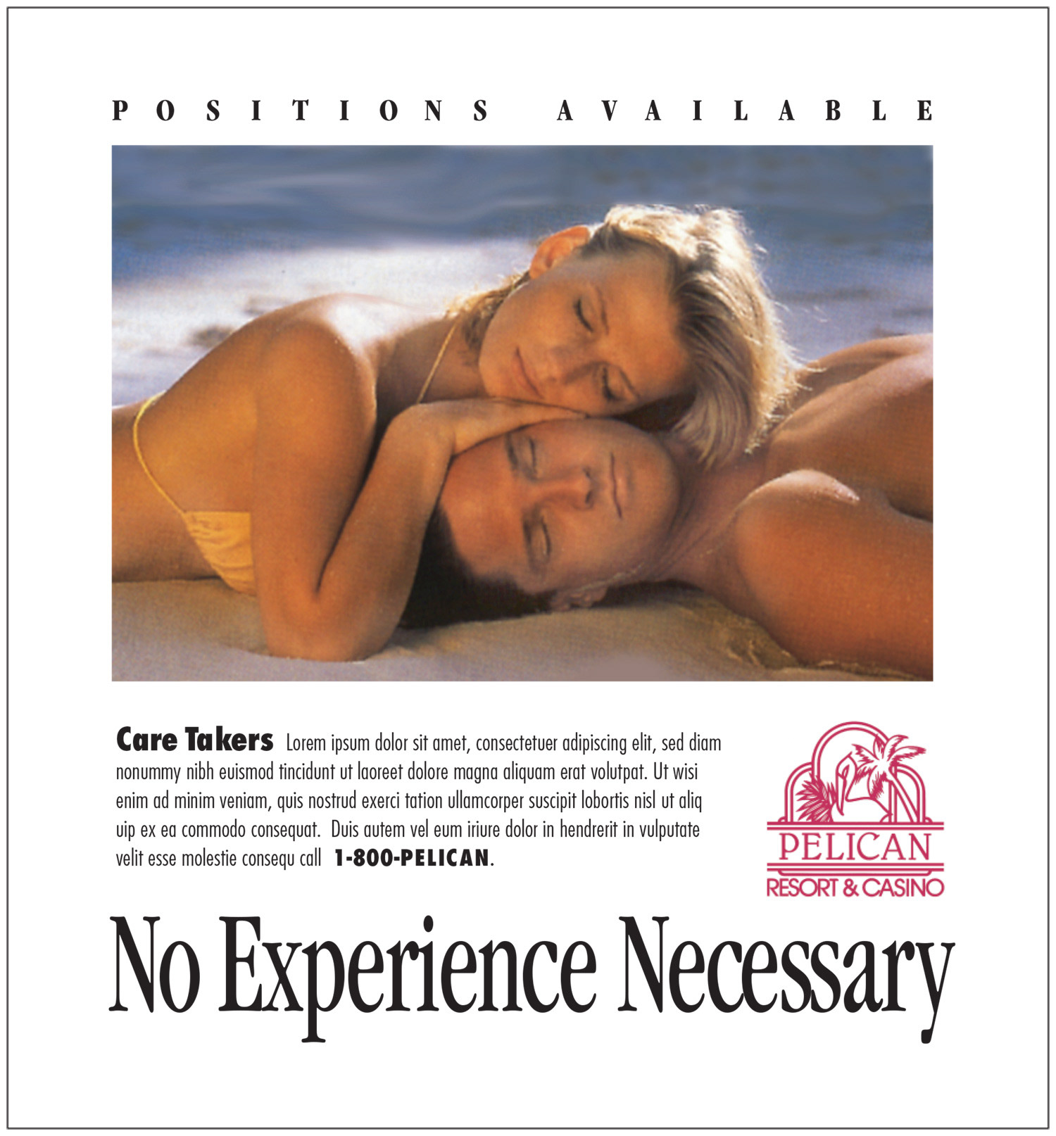
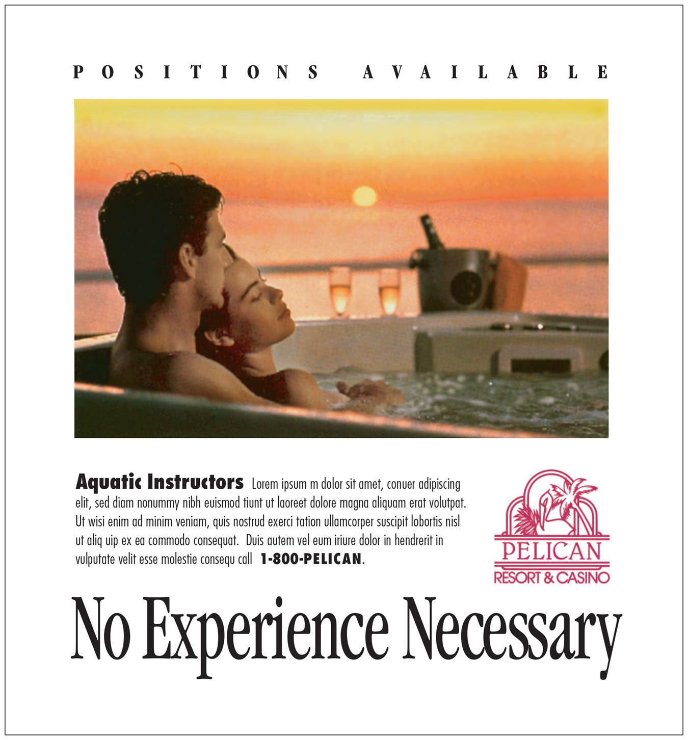
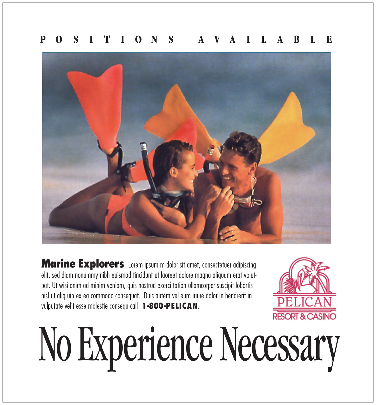
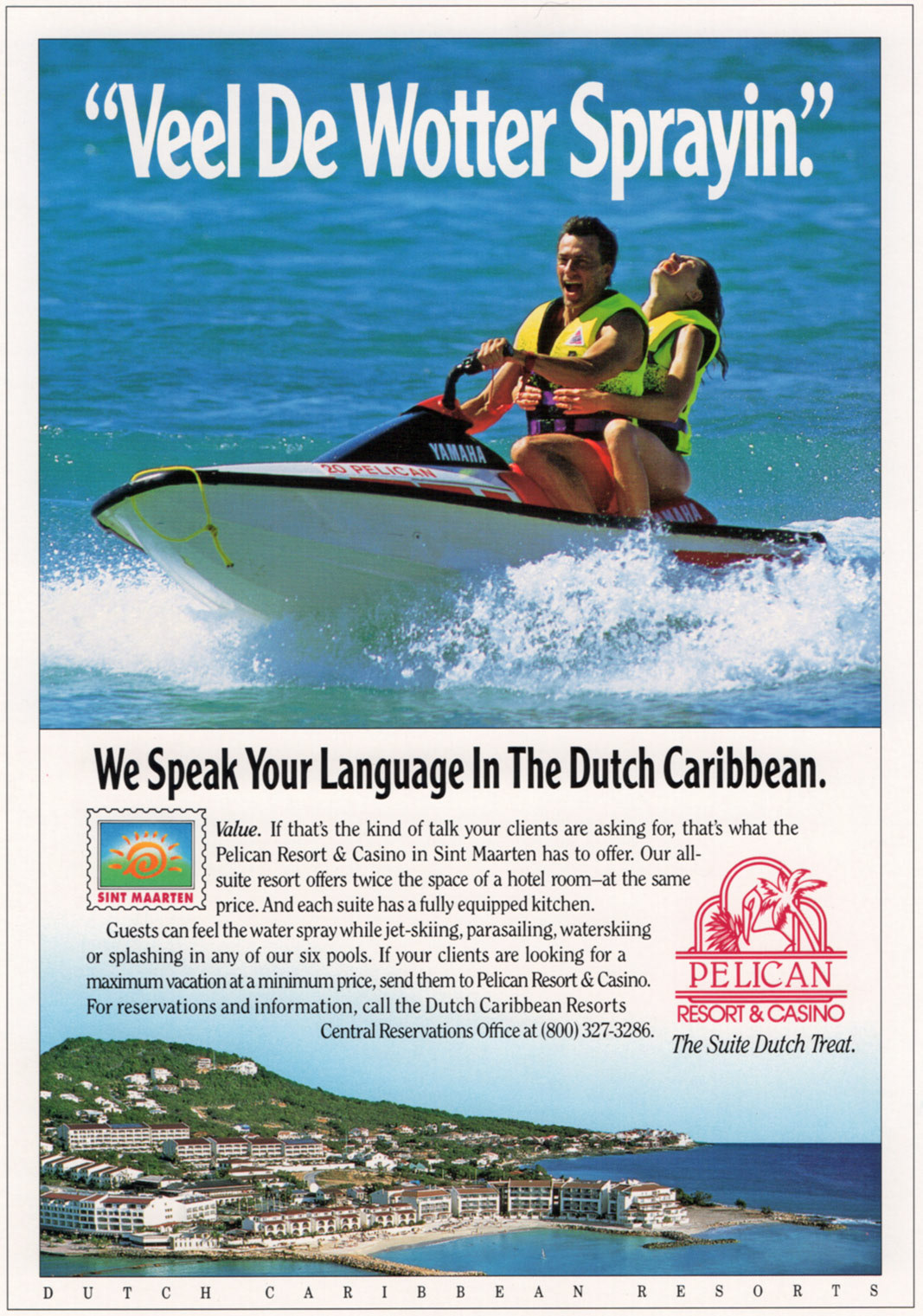
The campaign was to add additional credit cards to the account. We offered both Gold and Blue cards but also each had Mastercard® and Visa® associations, so the design had to work with the familiar logos cut out of the picture so we could manage print costs and fulfillment of the correct cards.

5 day photo shoot in St Maarten, Caribbean. 4 models averaging 6 shots per day. Photography by Robert Wiley Foto

Concept ads for Travel Trade publications.
RY&P Advertising, Orlando, FL — 1990

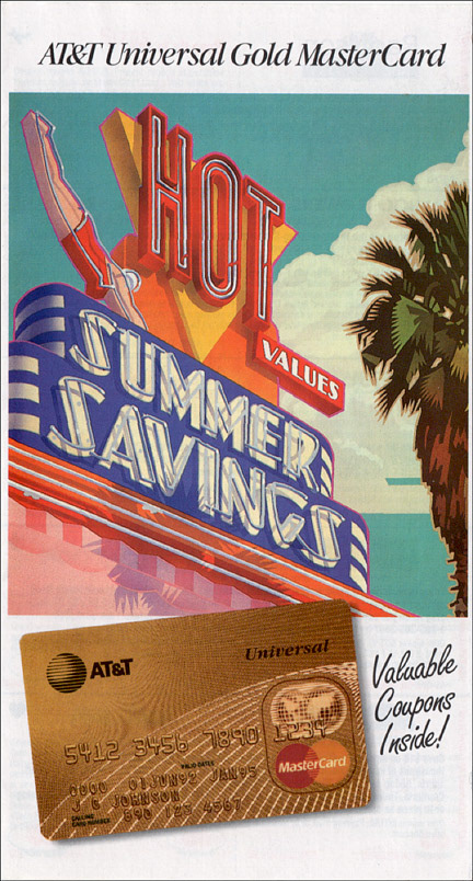
Back when Long distance calling had a separate value. Photography: Robert Wiley Foto

When the AT&T Universal Card launched, one if it's "features" was a calling card number, (it was when long distance calls still cost extra and the calling card number sent the charge to your account) which was managed by the "baby Bells" that were left over from the breakup of AT&T in 1982.
This was a 3-panel (21 x 6 flat) self mailer. We had a gold and a blue card, but it was too much production to run separate brochures for each card and to also keep up with people who had upgraded, so we ran the card image as black and white.

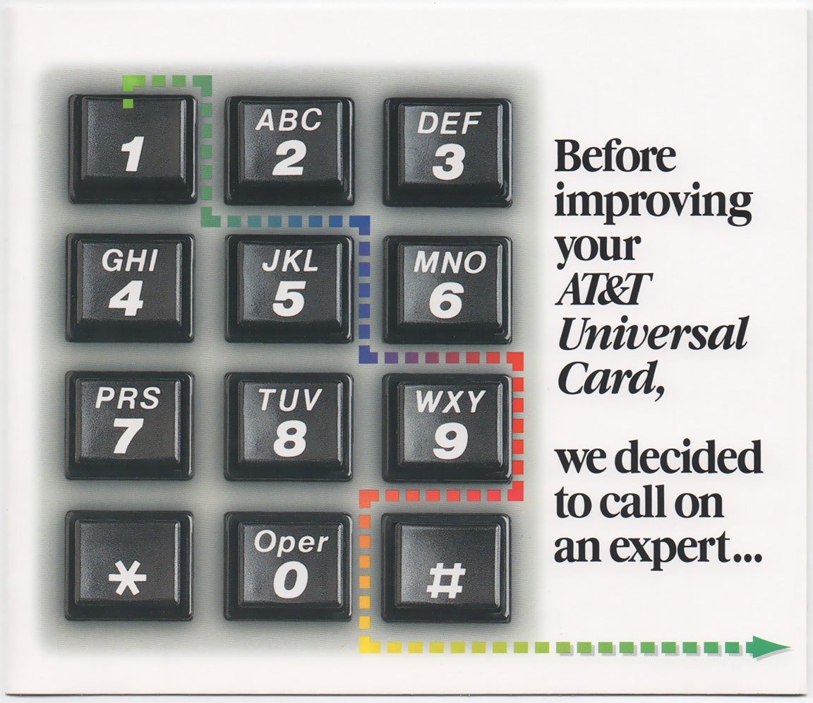
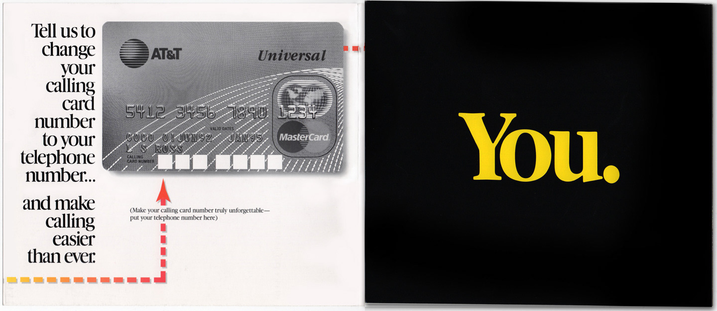
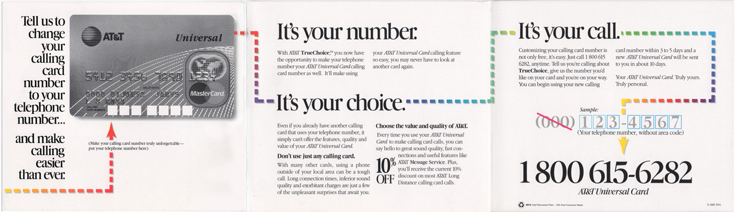
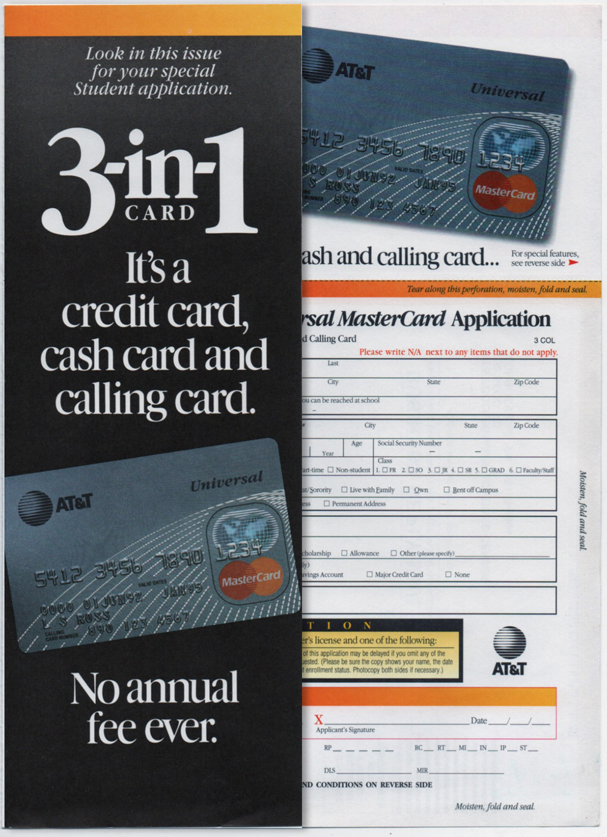
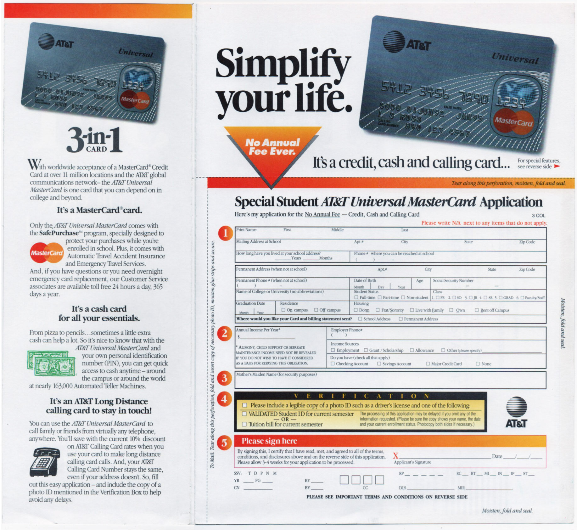
The first spread sets up a complicated message. We chose to break it up into bite side bits from
the copy skills of Jim Tormey at Jesse James Creative in NYC. I wanted the reader to be able to step through the instructions and end with a "call" to action, literally. So I used the dotted line graphic device.


This shows the context of the full spread laid out.
This piece received an unprecedented response rate of 14%
at a time when 1.2% was the average.

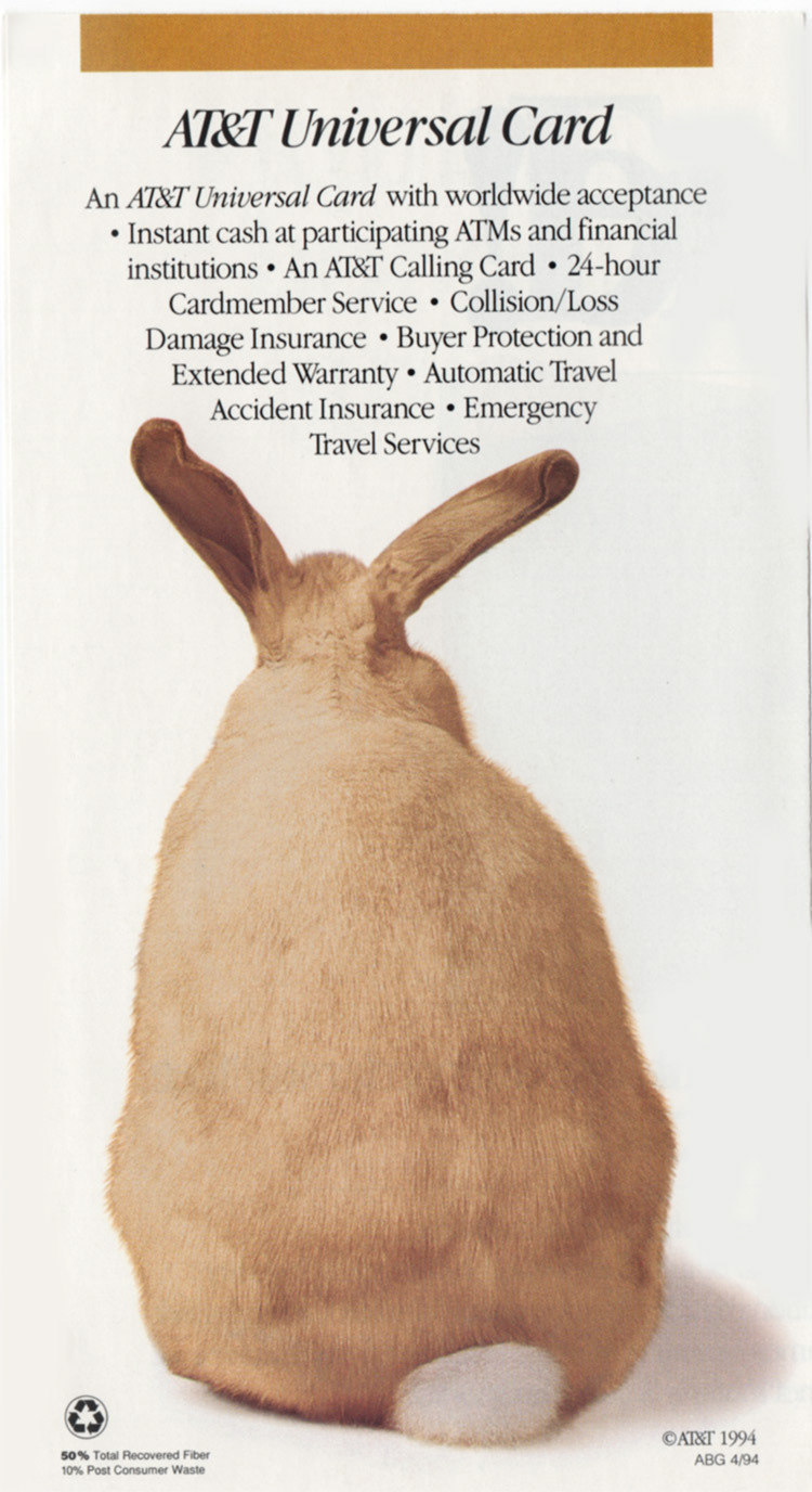
This was a very successful "Take One" display for college campus solicitation/ While competitors were trying to look hip with the latest MTV type grunge graphics, we decided to convey a very "adult look" strategy to reflect the serious nature of applying for their first credit card / a Special Student Offer.

Debit Card Designs for VyStar Credit Union
The idea with these explorations was to portray a patriotic theme without just using an American Flag. While the ultimate patriotic symbol, using it was a more obvious, less creative and unique solution. It's to be noted that the Blue Angels (top card) were first developed in Jacksonville Florida, the home of VyStar Credit Union.
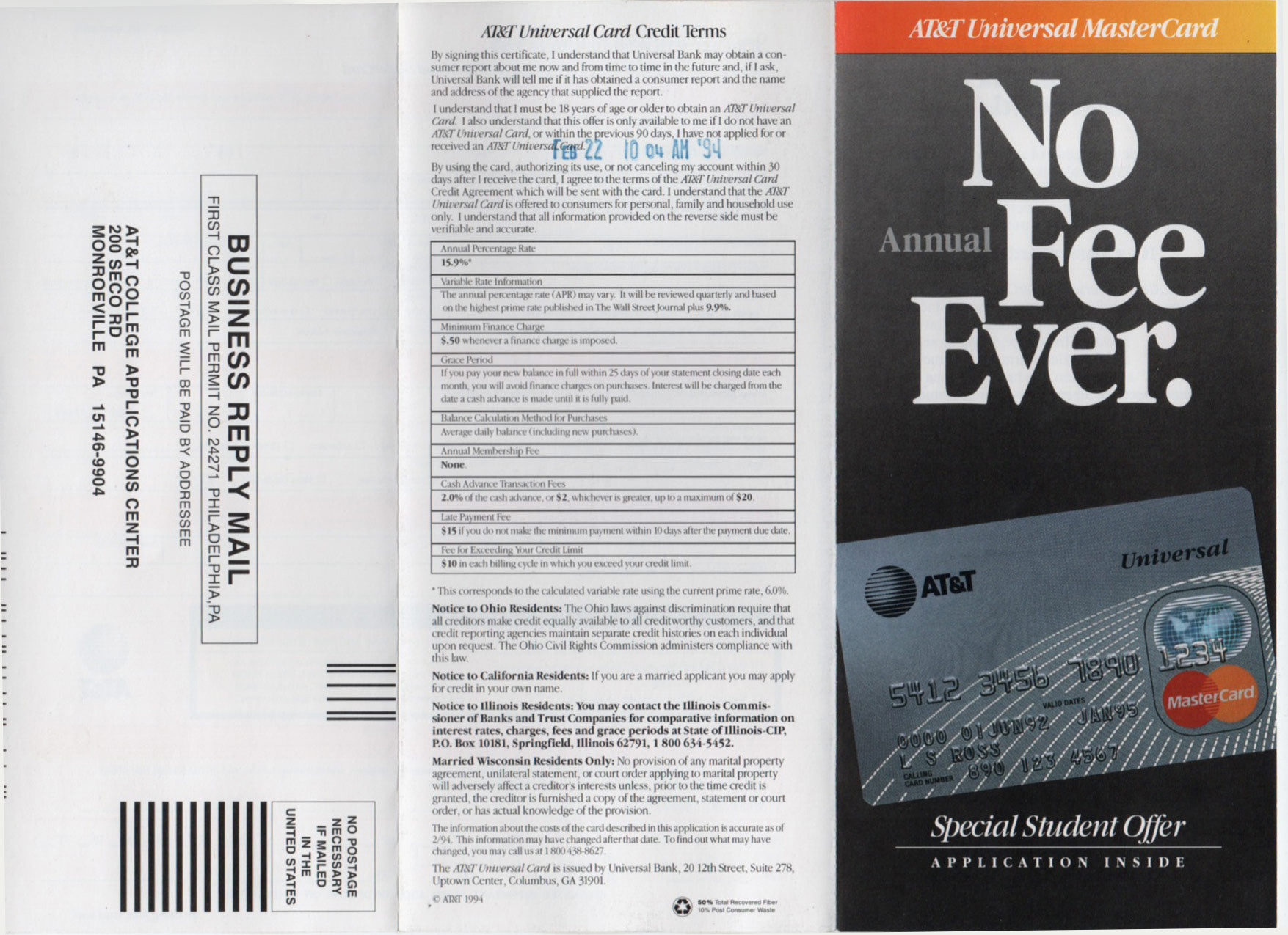
None of the designs were used however.
Back to Top