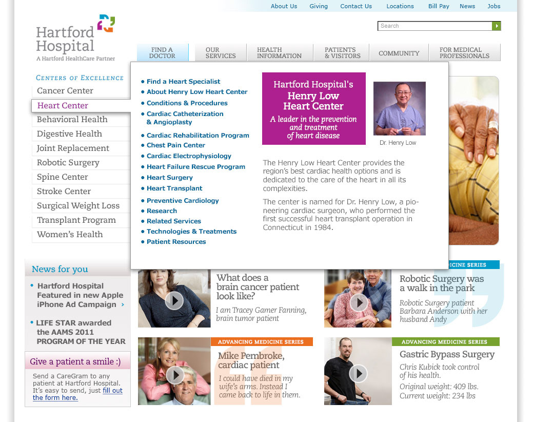
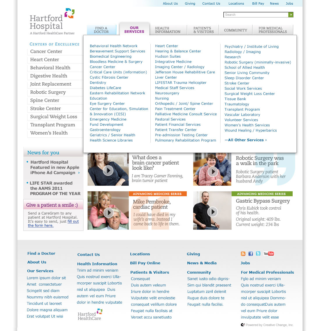

This shows a sample of the drop down menu. I did a screen for each one.
--------------------------------------------------------
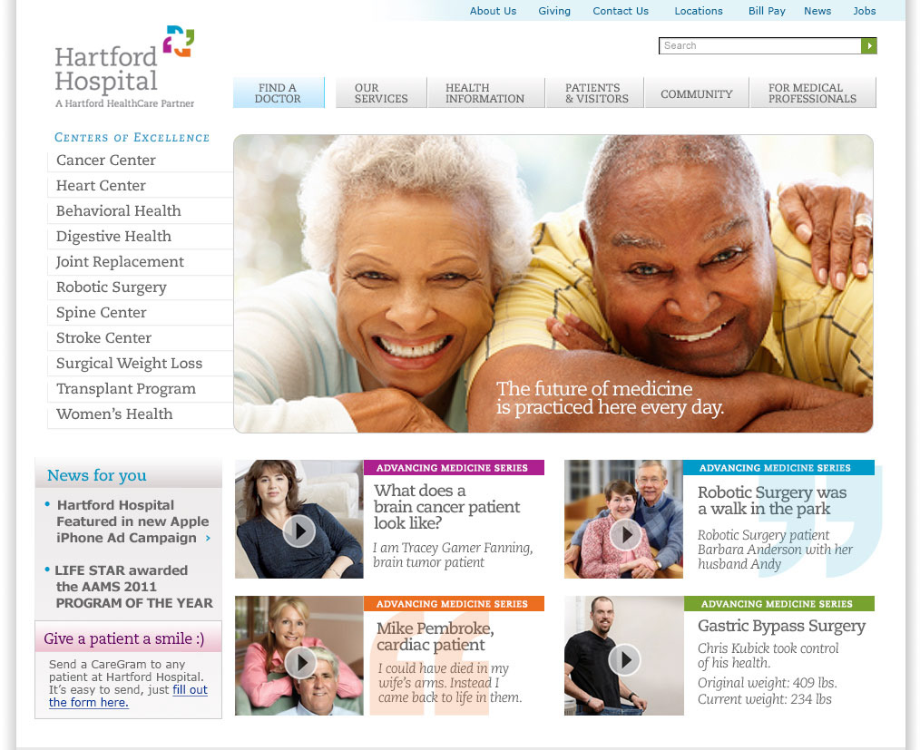
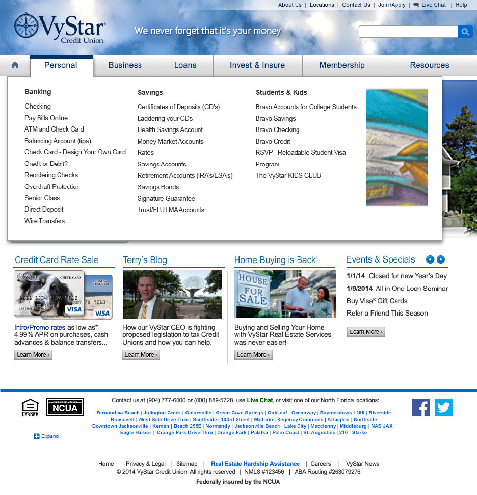
Below represents a home page audit. The goal was to identify why the page felt overly complex. To do that, we blurred the page to reveal the individual elements.
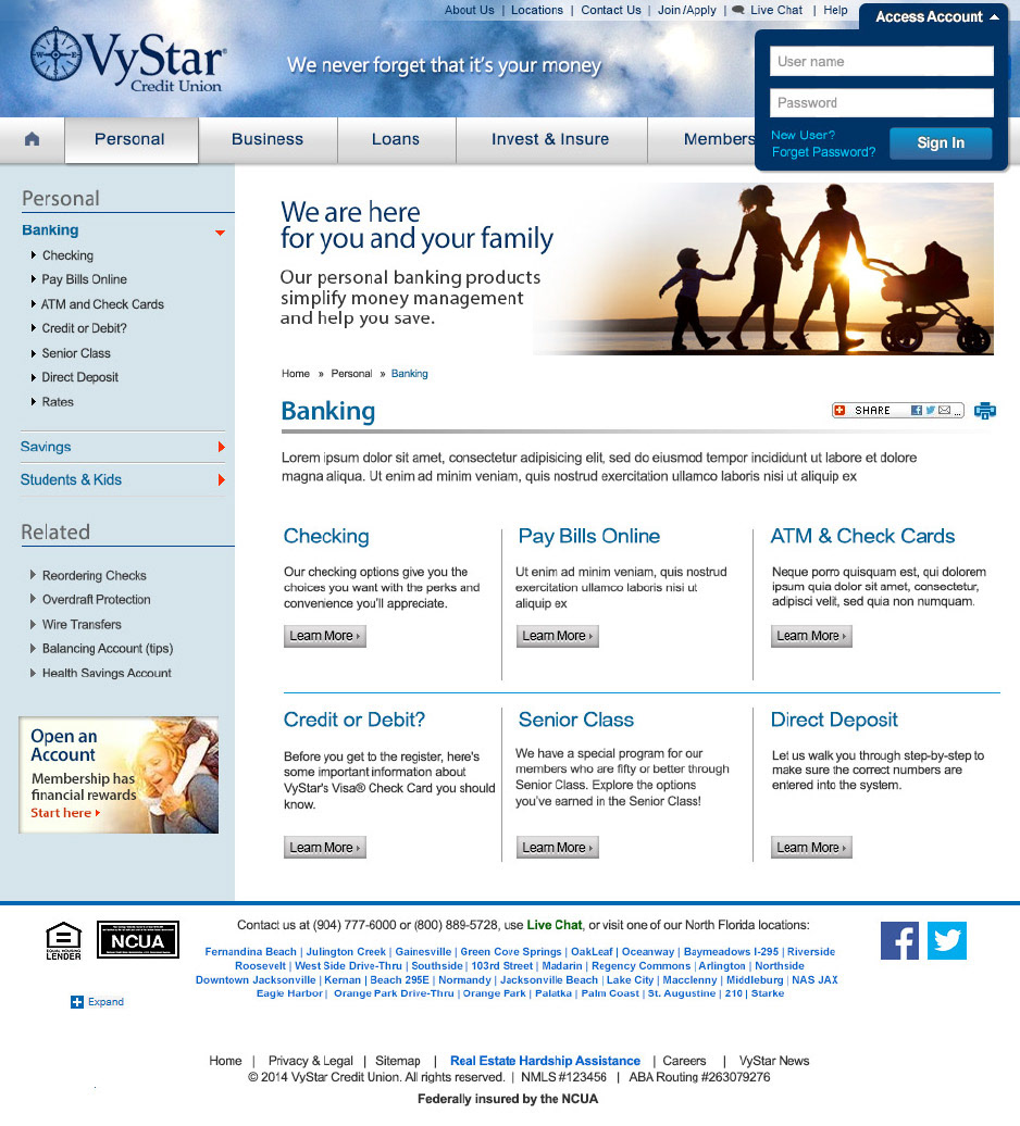
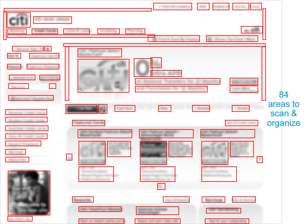
Then visually consolidate and organize the gestalt to group information fro easier visual scanning to improve usability
Then visually consolidate and organize the gestalt to group information fro easier visual scanning to improve usability
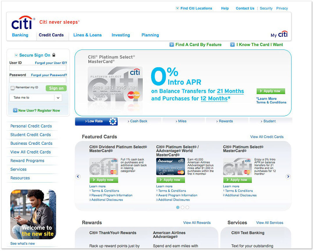
This is the exercise for simplifying the 84 visual elements
By blurring the page, the elements are easy to identify
These elements are visually disparate and can be better grouped
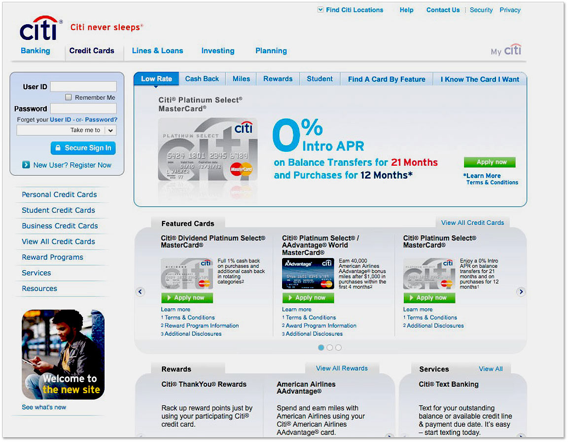
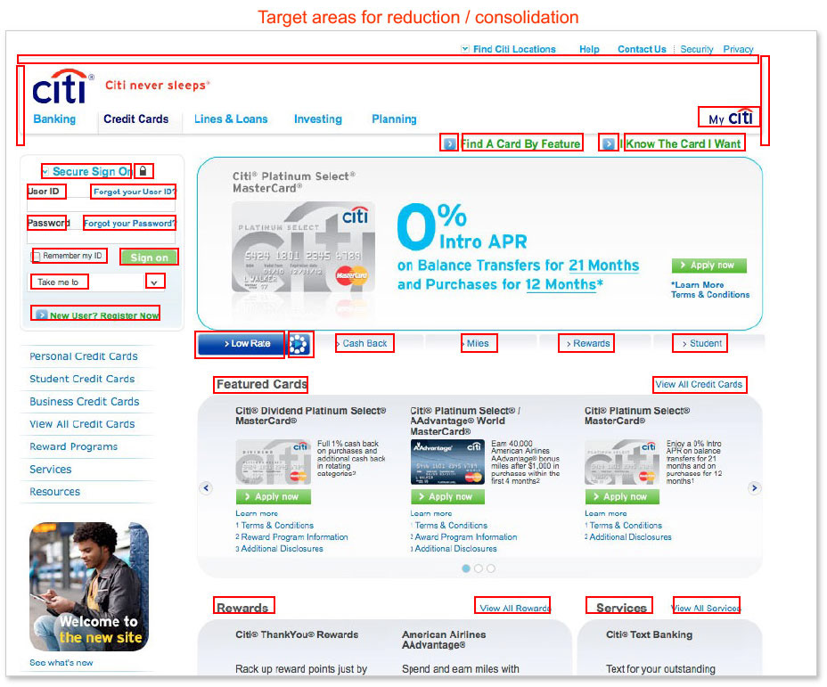
This is after the consolidation of visual "floating" elements
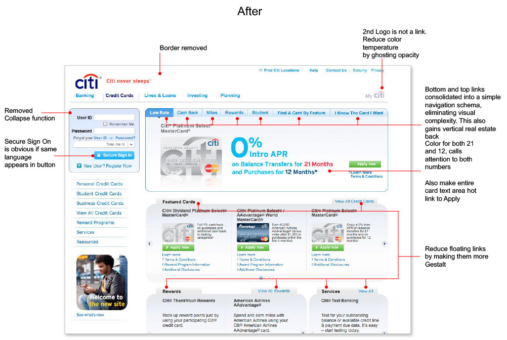
With "After" annotations
---------------------------------------------------------------------------------------------------------------
----------------------------------------
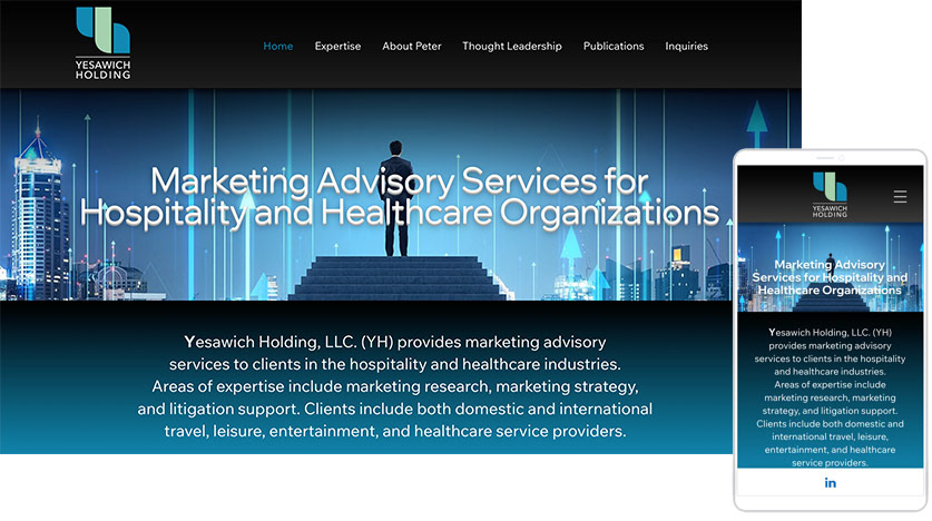
A site for a Hospitality & Healthcare consultancy
recently published in 2025.
Yesawich Holding is a unique advisory service, which draws on deep experience
in Hospitality and proposes ways to apply those service tenets to the
Healthcare sector—not typically associated with a hospitable approach to services.
Sample of site below...
-------------------------------------------------
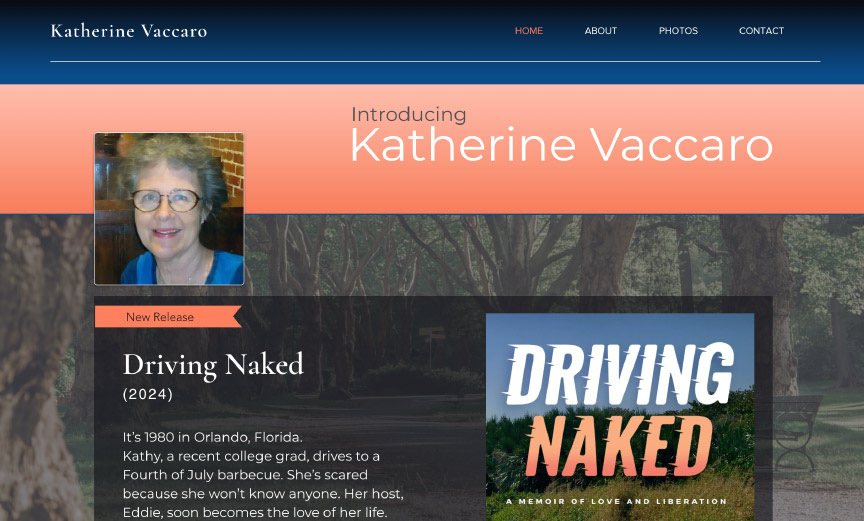
A Memoir Website designed and hosted on the WIX platform