

It was a "throw something together to pitch a possible client" thing. Our senior partner came back from the presentation— and said that the store had chains on the doors or something like that. I created the logo in less than 30 minutes, or it created itself is more like it.
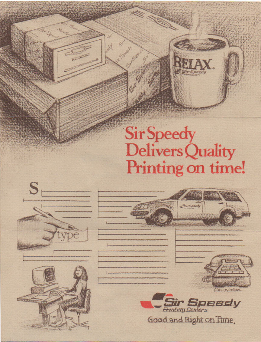
3 panel hand drawn comp on target paper
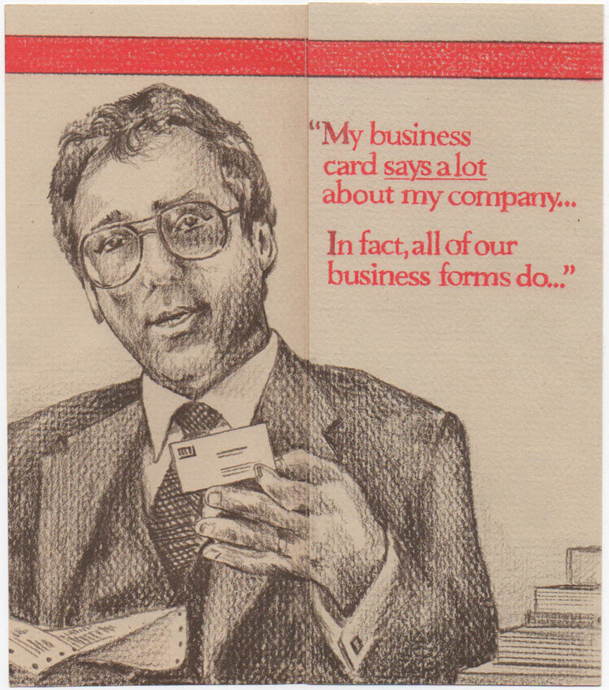
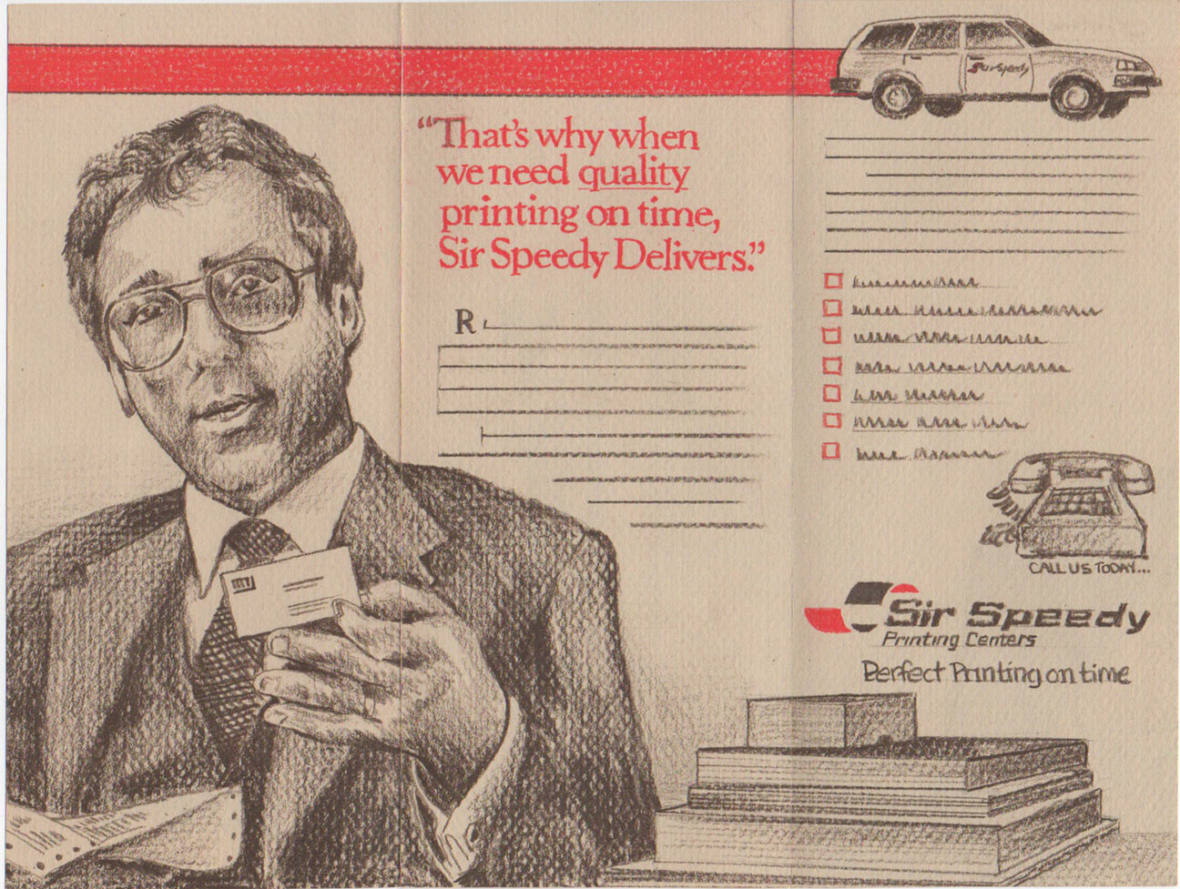
Early hand drawn comps on target paper stock. Colored pencil.
Pre-computer by about 5 years (1984).
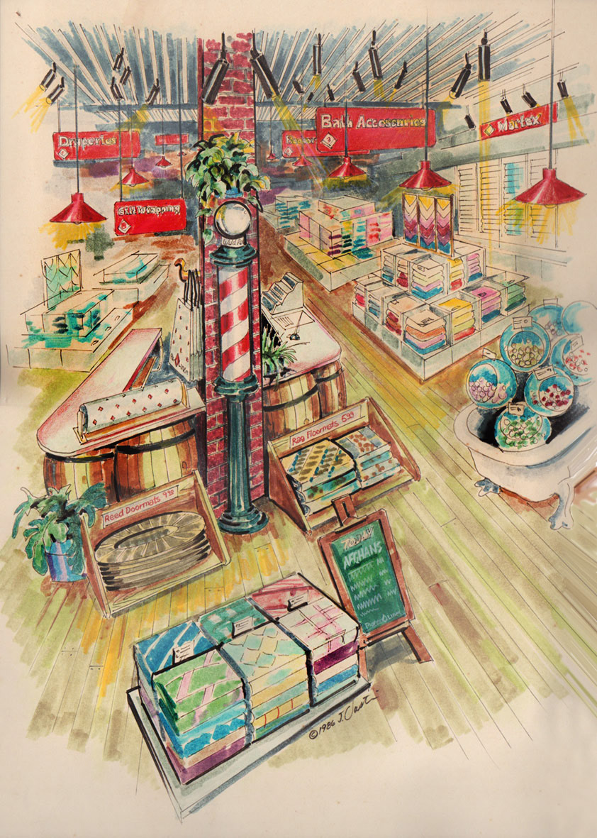
1986. We had a client in downtown West Palm Beach named Pioneer Linens that had been there since the 1920's. There was very little natural traffic and the big stores like Bed Bath and Beyond and the Malls were coming on strong, We proposed taking advantage of the genuine oldness of the place and make it a destination for a unique shopping experience. Plants, dark ceiling with spot lighting, wood floors, antique claw feet bathtubs with merchandise displayed in a combination of modern and old. Wrapping paper with the logo and generally an upscale feel.
Except for the antiques, the World Market or even Pier One Imports ended up as a similar experience. I drew this up, along with a long marketing rationale stating that advertising alone was not enough. They needed a reason for people to go out of their way to visit. The client couldn't quite get it. Fun from another era. Marker and ink.
Except for the antiques, the World Market or even Pier One Imports ended up as a similar experience. I drew this up, along with a long marketing rationale stating that advertising alone was not enough. They needed a reason for people to go out of their way to visit. The client couldn't quite get it. Fun from another era. Marker and ink.
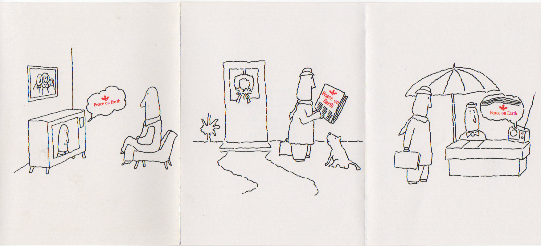
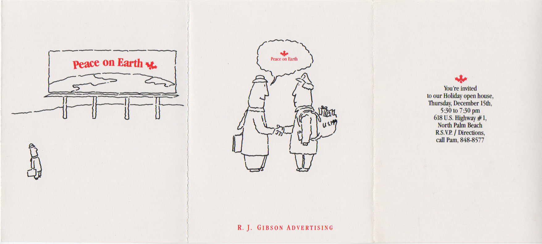
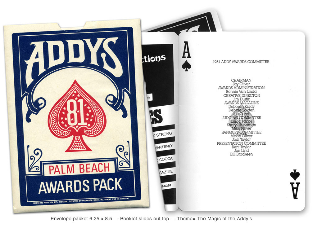
This dates to around 1983 when I had a design studio called Dustin Design —and I would do work for Ad Agencies that didn't have their own creative staff.
This was for a young entrepreneur (R. J. Gibson) a few years out of college who started his own agency in West Palm Beach. The invitation was an accordion fold (24 inches flat), 2 color, semi-gloss stock.
This was for a young entrepreneur (R. J. Gibson) a few years out of college who started his own agency in West Palm Beach. The invitation was an accordion fold (24 inches flat), 2 color, semi-gloss stock.
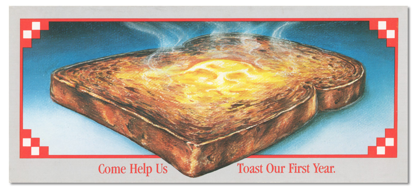
Invitation from my first design studio partnership, TJ Design. Tom Swartzbaugh and Jim Dustin
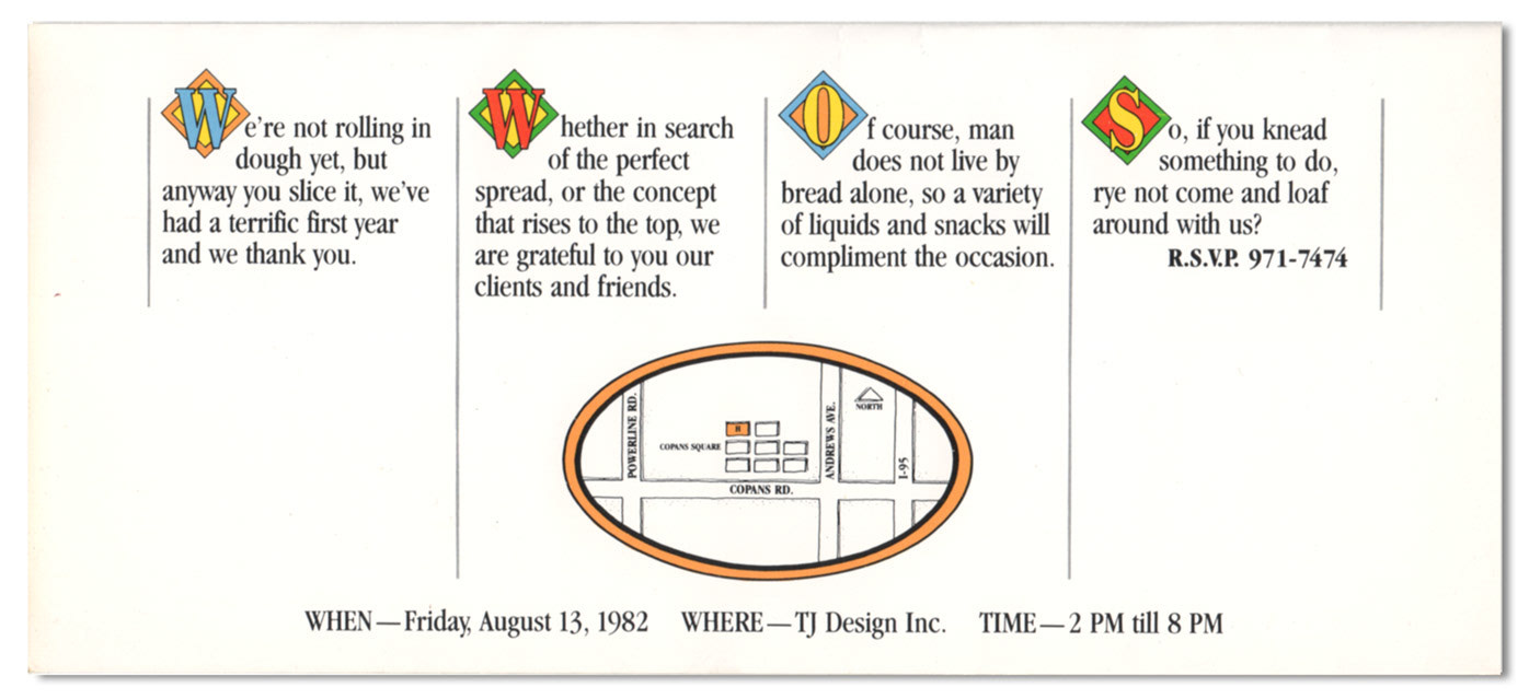
Inside copy was fitting for our approach.
This was 8 years before computers took over the tools of the graphic design industry.

This was at a time when the Web was still being invented, so the paradigm for the interface was more like a tablet form factor. This was a free-form conceptual exercise, looking for ways we could extend the brand, using a utility type of device.
Apple had designed the Newton PDA in 1993, and there were Apple PowerBooks in 1994, but this was thinking outside of the box for an organic looking form factor. There was absolutely no appetite for trying something like this, but it was quite fun to mock up what-if visual explorations. Sadly, my only remnant was a print out.
Apple had designed the Newton PDA in 1993, and there were Apple PowerBooks in 1994, but this was thinking outside of the box for an organic looking form factor. There was absolutely no appetite for trying something like this, but it was quite fun to mock up what-if visual explorations. Sadly, my only remnant was a print out.